Print works from a color model that uses different percentages of Cyan (C), Magenta (M), Yellow (Y), and Black (K) to achieve its appearance.
You’re familiar with the straightforward, visual results of printing in black + white versus printing in color. But did you know that there are two different types of black that can be used in print?
We’ll review the differences between standard black and rich black below, as well as when and how to use them.
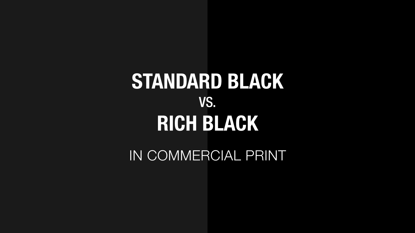
Standard Black vs. Rich Black in Commercial Print
Standard black uses only black ink or toner, whereas rich black uses elements of the other colors within the CMYK color model (Cyan, Magenta, and Yellow).
For example, if you print in black + white (A.K.A. 1-color print), or even standard black on a color print job, the press/printer uses strictly black ink or toner–no other properties from the CMYK color model are used.
But, in color print (A.K.A. 4-color print), a rich black can be produced to create a deeper and more saturated black by also using percentages of cyan, magenta, and yellow.
Considerations When Selecting Black
- Legibility: Layering toner to achieve a rich black can affect the printout’s crispness. This is because of a print term called “ghosting,” which results from different layers not lining up exactly in the print registration. If your black properties include small font sizes or thin lines, choose standard black to avoid the blurry remnants of the other layers.
- Quality: On screen, black color variations can be difficult to differentiate. However, when printed, rich blacks have a deep tone that pops from the page, while regular black can appear flat, muddy, or dull.
- Cost: Standard black uses less ink to print than rich black since there aren’t extra layers of color printed. Less ink = less cost.
Suggested Uses for Standard Black
- Text-only Documents: Text, especially smaller font sizes, thrives in standard black.
- Black + White Documents: Many documents, like manuals, work well with 1-color print jobs that only use black ink. Even if these documents contain images, the information can still be easily conveyed.
Suggested Uses for Rich Black
- Solid Black Areas: If you’re printing something with a heavy black background like a brochure or poster, you can prevent a grey-black muddiness by using rich black.
- Large Type: Unlike thin or small body text, headers and other large or bold font sizes do well with rich black to avoid a one-dimensional look that results from using standard black.
Our Recommended Rich Black Color Formula
For the best possible results, we recommend a rich black value of C40, M30, Y30, K100, or 40-30-30-100 for all printed products.
Bottom Line
If your prints rely heavily on black backgrounds or large and bold fonts, rich black will give added dimension to your piece.
On the other hand, if you’re working with small fonts (or a small budget) standard black and 1-color prints are the better way to go.